


Table of contents
The human brain is literally the most complex machine in the entire universe. It sees everything and interprets it in its own way.
The study of the human mind, about how it perceives and responds to things in different scenarios, is what we call ‘Psychology’.
Gestalt principles are based on the ability of the human brain to see things that are not there, to complete the gaps within images and visuals, and to see the whole in whatever way possible, that’s why we see shapes in clouds.
In this blog, we are going to learn more about Gestalt psychology and how it helps in UI/UX designing -
What is Gestalt Psychology?
A school of thought that considers the human behavior and mind as ‘One whole’, is what we call Gestalt Psychology.

A core belief in Gestalt psychology is holism, or that the whole is greater than the sum of its parts.
While looking at our surroundings, Gestalt psychology suggests that the human mind, unconsciously, does not focus particularly upon the smaller components, instead, it takes everything at once and perceives all objects as the elements of the bigger picture.
This psychology principle has played a major role in introducing modernism into the contemporary world of human sensation and perception study.
Table of contents
History of Gestalt Psychology
While talking about Gestalt Psychology, one should know that ‘Gestalt’ is a German word that implies ‘pattern’ or ‘configuration’ in its simplest definition.
Now, getting into its history is a fascinating topic. Let’s start with its founders & psychologists, Max Wertheimer, Kurt Koffa, and Wolfgang Kohler who sought to study the “intrinsic nature of the whole” while doing their research in psychoanalysis & behavioral therapy.
According to these psychologists, social psychology is widely dependent upon a person’s perception.
Kurt Koffa, one of the founders, applied the principles of Gestalt psychology in child psychology, arguing that infants first understand things holistically before learning to differentiate things into parts. He has due credit for bringing Gestalt principles to the United States.
Wolfgang Kohler connected Gestalt psychology to the natural sciences, arguing that organic phenomena are examples of holism at work. He further studied the problem-solving approach in chimpanzees.
On the other hand, Max Wertheimer is primarily considered the father & inventor of gestalt psychology, who also introduced the idea of an institute for the same. His observations on the (Phi phenomenon) were widely considered the stepping stones for Gestalt psychology.
Table of contents
Insight Learning Kohler
Patterns among the observations we make about the outside world are called Insights. They give us knowledge of a particular cause and effect in a particular situation. They help us to explain our findings.
Our ability to solve a problem changes, when we have an insight, from not knowing how to do it to knowing how.
When playing a video game on a computer, you’ll experience impediments that require you to utilize the insights to move to the next level.
Chimp Experiment
German psychologist Wolfgang Kohler was researching the behavior of chimpanzees in the 1920s.
He created a few straightforward tests that resulted in the creation of insight learning, one of the earliest cognitive theories of learning.
In this study, Kohler placed a piece of fruit just out of each chimpanzee’s grasp. He then gave each chimpanzee either three boxes or two sticks, and he waited and observed.
Table of contents
Kohler observed that the chimpanzees paused, took a seat, and considered a solution after realizing they couldn’t easily reach or jump up to grab the fruit. After a short while, the chimpanzees stood up and succeeded to fix the issue.
- In the first instance, the issue was resolved by combining the smaller sticks with the longer stick to make one incredibly long stick that could be used to knock the hanging fruit to the ground.
- In the second scenario, the chimpanzees would find a solution by piling the boxes on top of one another so that they could climb to the top and obtain the fruit.
Design
Gestalt concepts were first used by designers in their work in the 1920s. These designers were influenced by gestalt psychology, which made them think that everyone has a specific set of perception traits and an innate sense of recognizing an “excellent” design.
Gestalt principles were adopted by designers, who based their work on how we perceive contrast, color, symmetry, repetition, and proportion.
Table of contents
The Principles of Gestalt Psychology
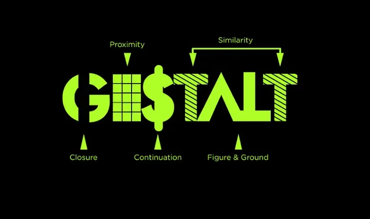
Gestalt psychology had a role in popularizing the notion that perception involves more than merely observing what is actually there. In fact, our intentions and expectations have quite an influence on it.
To describe how Gestalt perception works, Wertheimer developed a set of principles. The following are a few of the most important of them-
Principle of Figure-ground
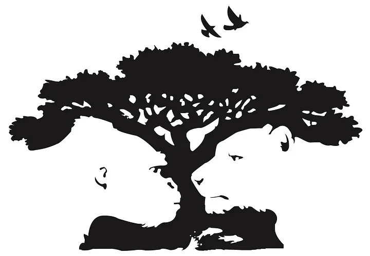
According to the figure-ground concept, people automatically classify objects as being in the foreground or background. They either dominate the front (like the figure) or fade into the background (the ground).
For instance, in the image above, some individuals may immediately recognize the tree and the birds, while others will notice the gorilla and the lion staring at one another.
The figure/ground principle can come in very handy when product designers want to draw attention to a focal point, especially when it is in use or active.
For instance, when a modal window appears and the rest of the website fades into the background, or when a search bar is clicked and the contrast between it and the rest of the website is increased.
The Law of Similarity
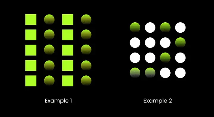
According to the concept of similarity, we group things together when they seem to be similar to one another. We also have a tendency to assume that they serve the same purpose.
Table of contents
In a design, similarity can be utilized to connect items that aren’t necessarily near to one another.
Even though there is no order to the circles’ location, and they are all the same size and spacing, we automatically group them by color.
Utilizing similarity in UI/UX design helps visitors understand which products are related. The similarity principle, for instance, would enable quick scanning of a feature list with recurring design components (such as an icon accompanied by three to four lines of text).
Changing the design elements, however, makes the things you want to draw attention to stand out and conveys a greater sense of importance to visitors.
Of course, if you want anything to stand out from the crowd, you can make it different. In order to stand out and bring visitors’ attention to the intended action, designers often use buttons for calls to action in a color different from the rest of a website.
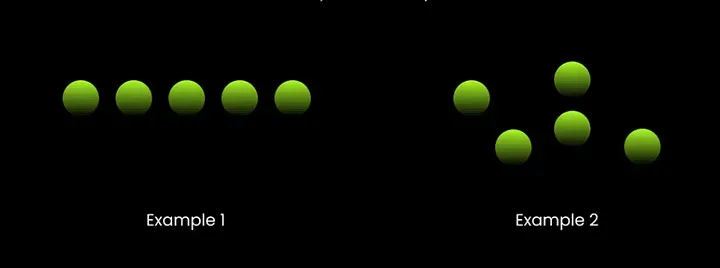
The Law of Proximity
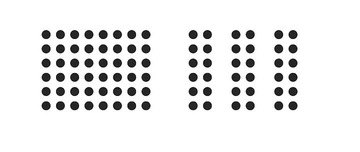
According to the principle of proximity, objects that are close to one another seem to be more related than those that are farther apart.
Because proximity is so potent, it triumphs over similarities in color, form, and other characteristics that may serve to distinguish a group of objects.
The proximity of the lines in the above image is the only thing separating the group on the left from the group on the right. And yet, the image on the right appears to your brain as three separate groupings.
The proximity in UX design encourages users to group related items together without the use of barriers like hard borders.
Like objects should be placed near together, with space between each group, so that the spectator can immediately recognize the organization and structure you intend. Each image’s proximity to the accompanying text indicates that the two are connected. The photographs, headlines, descriptions, and other information for each of Vice’s stories are differentiated using this technique.
Table of contents
The Law of Common Fate

According to this principle, people would group things that point in the same direction or are moving in the same direction.
This is really helpful for UX as animated effects are increasingly used in contemporary design. Note that elements must appear to be moving for this approach to work, even though they do not actually need to be moving.
The Law of Continuity
According to the law of continuity, no matter how lines are really drawn, the human eye will always follow the path that is the least bumpy while perceiving them.
Even though the lines change color in the middle, the eye is prone to want to follow the straight line from one end of this figure to the other and the curved line from top to bottom.
When the intention is to lead a visitor’s eye in a specific direction, this continuation can be a useful tool. Make sure the most important information on the page falls within the simplest path possible for them to follow.
Since the eye follows lines naturally, arranging objects in a series along a line will cause the eye to naturally move from one object to the next. Examples of this kind of design include using horizontal sliders like it’s done in product listings on the Amazon website.
Table of contents
The Law of Closure

It is literally the tendency of a human brain to fill any gaps in a design or image to see the bigger picture, even if it’s not there. The idea of closure, in its most basic form, enables your eye to follow an object, such as a dotted line, to its conclusion.
The panda logo for the World Wildlife Fund is a wonderful example of the gestalt principle of closure. The brain completes the white shapes, even though they’re not well-defined.
When you show a portion of a picture fading off the user’s screen to indicate that there is more to be seen if they swipe left or right, you are using a closure in UX and UI design.
When just entire images are displayed, the brain does not quickly recognize that there may be more to be seen, which reduces the likelihood that your user will scroll (since closure is already apparent).
Even loading indicators, progress bars, and sliders use it.
Table of contents
Bottom Line
If you understand how the human mind works, it’s easier to direct people’s attention to the right place. And keeping these principles at the top of your mind will help you focus on delivering a seamless user experience while working on web designing solutions.